You can’t spend a day, even an hour without seeing a logo; from what your wear, to what you eat to the phone in your pocket. Logos are everywhere and I’m sure you can name quite a few. Whether a word-mark or an icon, they can be quite simple or a little more complex. The majority won’t consider the meaning behind them, other than the fact they represent our favourite brands. But have you ever looked closely and noticed a hidden meaning? Well in this blog we’ll show you a few we’ve uncovered.
So, take a look at the yellow arrow, what do you see? A smile of the happy customer or the fact it’s going from a to z, representing the online retailers wide range of goods.
Probably one of the best known ‘hidden message’ logos. Take a look between the ‘E’ and the ‘X’ what do you see in the white space? A arrow. The logo’s designer; Lindon Leader has said ‘The arrow could connote forward direction, speed and precision…’
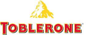
Ever noticed the bear within the mountain? No, neither have many people; too distracted by the chocolate I presume. The company owned by Mondelez International was started in Bern, Switzerland which has a bear on its coat of arms. If you also look within the actual word you can see Bern, coincidence? Who knows.
Beats by Dre is a pretty simple logo, a b and a circle, right? The circle is to represent a human’s head, whilst the ‘b’ is to show the headphones, giving the personal element allowing the user to see themselves wearing the product as the whole logo is a side view of someone wearing headphones. Clever when you think about it.
There’s 2 messages hidden in this logo, the obvious being the ‘r’ as a cyclist however there’s another more subdued message; the yellow circle not only acts as the bike’s wheel but as the sun, indicating the events of the face only occur during the day.
A worldwide recognised logo, most people recognise the ‘L’ and the ‘G’, but did you know those letters help make up a face? The ‘L’ being the nose and the ‘G’ for the rest of the face. Bring up the nose and tilt 45° and you can even see Pac-Man.
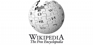
No, it’s not the Death Star under construction but according to Wikipedia, the unfinished globe represents the unfinished nature of the project; with the languages yet to be discovered waiting to complete the jigsaw puzzle. Each piece of the existing pieces is ‘glyphs’ stating the first letter of ‘Wikipedia’ in languages that have been written.
The razor company have made their point, their sharp point by removing parts of the ‘G’ and ‘i’ with their sharp razors.
So, as you can see sometimes you have to look a little closer and you can uncover hidden meanings behind your favourite logo. Some logos don’t have hidden meanings and that’s fine, when they’re forced into logos sometimes it detracts from the purpose of the logo. Quite a lot of thought has gone into the logo design process, here at AMA, it’s something we’re proud of. Your logo represents your company and it needs to stand out for the right reasons.
Some of the brand identities we’ve done are below, see if you can identify the hidden meanings in them.
Did you know that Sirius is the brightest star in the sky? Well that’s the reasoning behind having the tittle (the dot of the i) as a star to represent that Sirius are the best at what they do and like to stand out.
Not quite a hidden meaning but the reasoning behind CSGs colourful logo is there were 7 recruitment agencies, all with their own specialism owned by the same company. The 2 founders helped by investing half the money to help set up the 7 different companies; however, in October 2015 they all came together under one brand; CSG. Each specialism has its own colour, which can be seen in the primary logo with the Spur (the straight part of the G), representing an arrow connotating the forward thinking and direction the company wish to go.


 Back to all articles